Week 1
To begin our research, we will be reviewing a few online coronavirus resources. This will help consolidate reliable sources of information.
1) The COVID-19 Tracking Project
Overview
The most complete testing data and results for the U.S. are publicly available for download as a CSV or for access through API requests. Here is their data api.
Analysis
I used the API and the /api/us/daily endpoint, which consists of US historical data, to conduct my own mini analysis. I asked the question: What are the trends in the increase of positive cases and negative cases as the number of test results increase?
View the python notebook here.
The plot at the bottom of the notebook shows a correlation between the number of test results and positive and negative cases. As the number of test results increases, we also see a large spike in the number of negative test results, which I would say is a good thing. We also see a much smaller spike in the number of positive results. Right now, the purple line for “increase in positive cases” is slightly sloped upward, indicating that each day more people are testing positive than the day before, but not significantly more people. The purple line for “increase in positive cases” is not hiking upwards, and ideally we want to see that line begin a downward slope. That would indicate to us that as the number of test results increase, the number of people testing postive is becoming less than day before. Similarly, we want to see the blue line labeled “increase in negative cases” continue hiking upward. This would indicate that each day, more people are testing negative than the day before.
2) Complete Genome Sequence of a 2019 Novel Coronavirus (SARS-CoV-2) Strain Isolated in Nepal
Overview
A swab specimen of a Nepalese resident, who acquired the virus in Wuhan, China, and imported it to Nepal, allowed for a complete genome sequencing of a SARS-CoV-2 strain. This journal was written in early February and published in early March, so the information is from earlier stages of the pandemic.
The Genome Sequence of Coronavirus 2019
The swab specimen genome was compared to two previously sequenced genomes for SARS-CoV-2 from Wuhan, China. There was >99.99% identity.
The final sequenced genome of SARS-CoV-2 is a single, positive-stranded RNA that is 29,811 nucleotides long.
- Nucleotide breakdown:
- 29.86% adenosines
- 18.39% cytosines
- 19.63% guanines
- 32.12% thymines
3) FOLDING@HOME
Overview
The project’s goal is to simulate protein dynamics, like protein folding and movement, in order to understand the diseases that result from protein misfolding. This is achieved by using computer simulations.
This project is powered by distributed computing, which is when multiple computers are used to run components of a software in order to improve performance. It needs to run calculations on millions of computers at a time.
Fun Fact: Guinness World Records recognized the Folding@home distributed computing network as the most powerful in the world!
The project hopes to produce results in the form of peer-reviewed publications and public lectures.
How did the Folding project begin?
The Folding@Home software went public in the year 2000. Since then, thousands of computers have contributed to powering research for Alzheimer’s, Cancer, Parkinson’s, Huntington’s, Malaria, and began publishing about coronavirus in March of 2020.
A more detailed project timeline can be found here
Here is what the Folding project is doing for COVID-19
They want to understand how the coronavirus works so they can design therapeutics to stop them. The difficulty is that proteins have a lot of moving parts.
Biological experiments cannot see all the structures, components, arrangements, and movements that determine the protein’s function, so seeing the protein in action is important.
Additional details about what Folding@Home is doing for coronavirus can be found here
4) Nextstrain
Overview
Real-time tracking, analytics, and visualizations of coronavirus data that is submitted by labratories and publically available through GISAID. This real-time data helps improve outbreak response.
Analytics
The data is presented in a phylogenic tree, showing the spread of the hCoV-19 viruses. The root of the phylogeny starts in Wuhan, China in Nov 2019, and continues to branch with human-to-human transmission.
You can narrow the visualization with filters: Filters include by labratory submission date, country, region, and submitting lab.
Nextstrain’s Bioinformatic Toolkit
Nextstrain uses the bioinformatics toolkit called Augur.
Augur has commands for different bioinformatic tasks. For example, augur translate will will translate gene regions from nucleotides to amino acids. Here is a full list of Augur commands.
5) COVID-19 analysis using the Galaxy Project
Overview
Analysis of SARS-CoV-2 data conducted with open source tools and publicly accessible infrastructure, such as the Galaxy platform and BioConda, making it easy to reproduce.
Analyses
Three different workflows are featured:
- Genomics: This analysis assembles a SARS-CoV-2 genome and looks at sites for intra-host variation. The current results show 397 sites showing intra-host variation across 33 samples.
- Evolution: Looks at what positions in the SARS-CoV-2 genome can be a location for positive selection (involved in adaptation), or negative selection (static during evolution). Currently, the analysis has found about 5 genomic positions that should be considered for further investigation because they are a condidate for diversifying and evolving. A key finding when analyzing the genomic divergence of COVID-19 was that there is no clear upward trend that might indicate that the virus is evolving away from the founder strain.
- Cheminformatics: Performing computational analysis to identify potential inhibiting compounds that can bind to the proteins that are vital for the life-cycle of SARS-CoV-2. Inhibiting compounds can be used to control how fast the virus replicates and grows, making it possible to create medicinal treatement. This analysis found 500 high scoring compounds that are likely to bind (from the 40,000 analyzed).
6) GISAID
Overview
An initiative to promote the international sharing of influenza virus sequences and data.
Analysis
Public data on GISAID of the hCoV-19 genome sequence was used by Nextstrain, mentioned above, to build this phylogenic tree.
If you register on the site and agree to uphold GISAID data usage rules, you can have access to all the genome sequence data submitted by labratories.
7) Johns Hopkins CSSE Data Repository for COVID-19
Overview
Johns Hopkins has designed a visual dashboard to display COVID-19 data in an interactive web-based interface.
Analysis
I recommend this dashboard because the information displayed is real-time, essential pandemic statistics. The general public wants this data in a quick, readable format. The dashboard is easy to read and displays information on one screen including total cases, cases by region, total deaths, total recovered, and a world map
Their data repository is publicly available on GitHub.
Week 2
This week, we are studying phylogenic trees. I gathered recent SARS-CoV-2 genomic sequence data from the GISAID website; 10 recent sequences from both the US and China. By building a phylogenic tree, I wanted to see how much variation there was in current sequences when compared to a SARS-CoV-2 Spike protein reference sequence in the virulign package.
I explain how to use virulign to align the target sequences with the reference. China, US, and combined data is put into respective dataframes. These dataframes are used to create a distance matrix, where distance of a sequence is the total number of nucleotides that differ from the reference sequence.
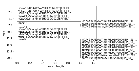
I thought I would find more variaton in the sequences between China and the US, and was thinking that the US might have a more diverse distance matrix. But, my phylogenic tree (above) show that recent submissions of SARS-CoV-2 sequences in both China and the US have about a 0-2 nucledotide distance from the reference coronavirus sequence.
In the combined phylogenic tree, which was built by combing the dataframes for the US and China sequences, I actually found that most US sequences were on the same branch (similar) and sequences from China were also grouped together on branches.
Week 3
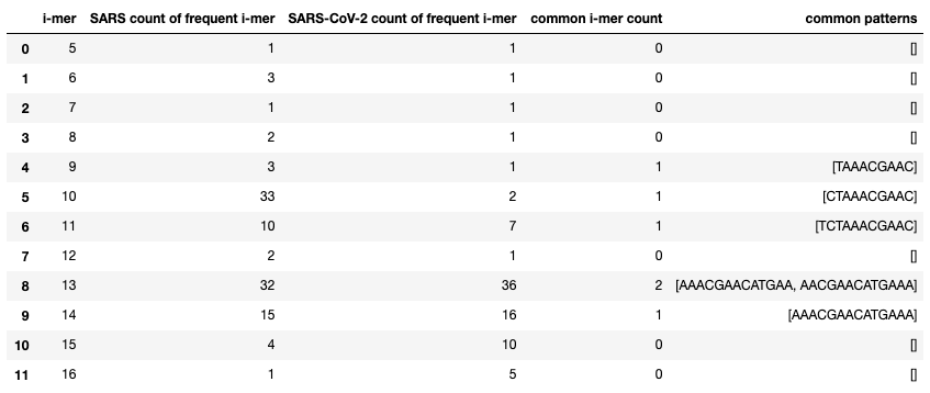
This week, I worked with both SARS coronavirus and SARS-CoV-2 sequences. I wanted to find differences and similarities in their nucleotide sequences.
My first analysis looks at the most frequent k-mers in both viruses, and counts how many of the same frequent k-mers occur in both. In the table below, I display the number of frequent i-mers for both SARS coronavirus and SARS-CoV-2, the number of common patterns between them, and what that common pattern is. I thought it was interesting how SARS had 32 frequent 13-mers and SARS-CoV-2 had 36, but they only had 2 common 13-mers.
My second analysis calculates the edit distance between each sequence, creates a distance matrix, and then visualizes a phylogenic tree (below).